Go Seattle

Go Seattle
A mobile application to promote public transportation among tourists
Role
- UX Designer
- Visual Designer
Tools
- Figma
- Sketch
Team
- Savong Tan
- Michael Palomo
- Madisen Arurang
- Aylee Neff
Time Frame
3 monthsContext
The Mobility Innovation Center, a Seattle based organization that aims to solve transportation issues came to our team with the request of fidning a solution to increase mobile ticketing usage among tourists in Seattle. Reduction of cash payments will ncrease operational efficency and reduce operation costs, since more than $5 million dollars alone is spent processing cash payments. One of the largest contributors to cash payments is tourists, which is the user group we were assigned to handle.
The current solution offered is the Transit Go mobile ticketing application, which allows users to purchase tickets for various modes of transportation in Seattle, including metro busses, the light rail, water taxis and more. Originally, our sponsors request a full marketing plan to increase usage of the app, especially among tourists. However, the app had very unfavorable reviews on the app store, a 2.4 rating and many usability issues. We came to the conclusion that it would be more effective to find out what tourists need in terms of mobile ticketing, and design from there.
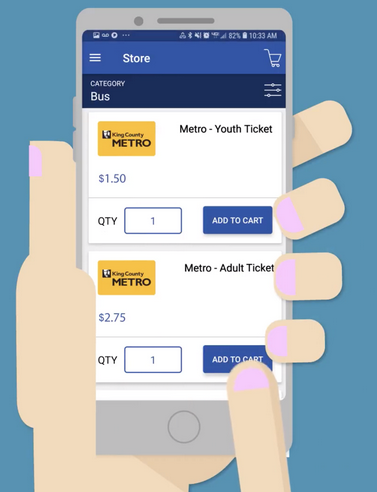
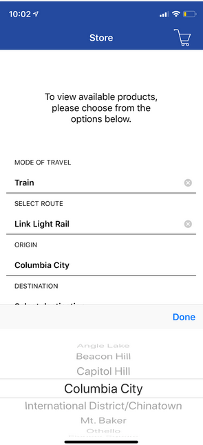
Transit GO ticketing app, he current solution offered by our sponsor that we would have to redesign.
“How might we increase and improve the experience of mobile ticketing use amongst tourists in the greater Seattle area who are current and potential customers of King County Metro and Sound Transit services?”
Research
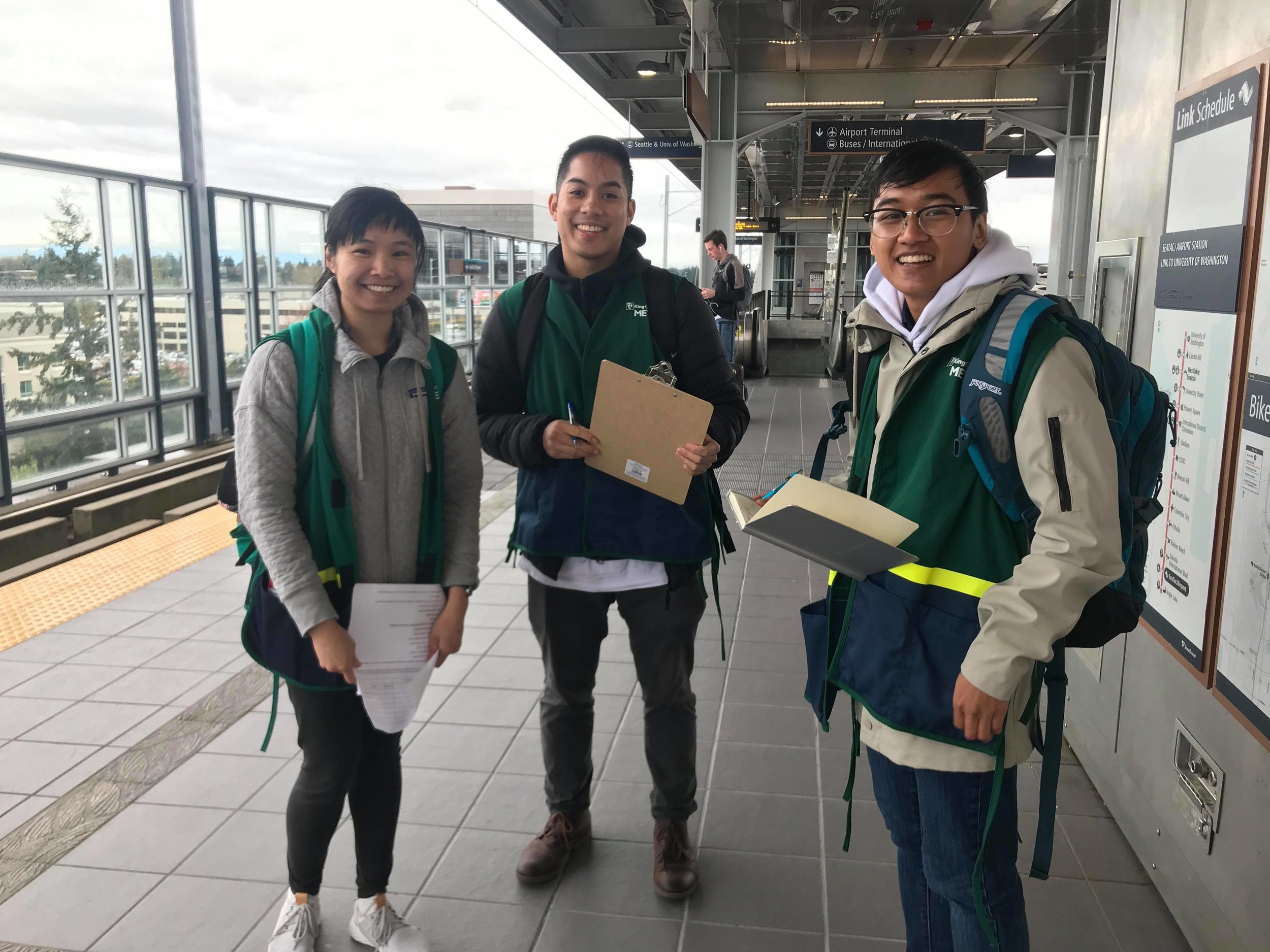
One of the locations our group went to recruit participants for our research was the SeaTac airport Light Rail Station.
Methods
The most difficult part of the research would be finding participants, since tourists are only in the area for a short term, we would be unable to schedule usability tests in advance. To combat this issue, I came up with the idea to do "on the fly" gureilla usability testing by going to popular tourist locations in Seattle, and approaching participants there.
Research was done in three phases over a three week period. The first phase was the planning and heuristic evaluation, then interviews and usability testing with tourists and a survey to confirm if information we got from interviews matched up with tourists' feelings towards public transportation on a larger scale.
Interview Goals:
- Figure out what modes of transportation they used to get around the city and motivations
- Familiarity and feelings with mobile payments
- Desires and goals for their trips
Usability Testing Goals:
- Evaluate user flow of trip planner, ticket purchasing and ticket activation.
- See if system model and mental model of ticket wallet and maps match up.
- Figure out any major pain points and confusion tourists have with using the app.
Survey Goals:
- Confirm if a mobile application is ideal for reducing cash fare payments among tourists
- Figure out how tourists learn about public transportation when travelling and what modes they use
- Learn tourist's ideal way for making payments for public transportation
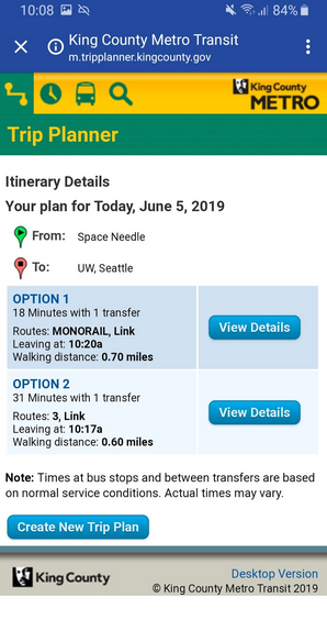
One of the usability test tasks was to utilize the Trip Planner to find bus routes, users were unable to complete the task without assistance because they were unfamiliar with the given landmarks and terms, and did not find the end result helpful because of the lack of visuals.
Research Findings
- Tourists mainly hear about modes of transportation in the city from word of mouth, there is a major lack of awareness of the Transit Go ticketing application.
- Tourists prioritize convenient and familiar modes of transportation, Uber and Lyft were seen more favorably compared to public transportation.
- The existing Transit GO application had inconsistent terminology that created confusion for our users who were already unfamiliar with the area, and not enough visuals for users to figure out how to use the Trip Planner or what ticket they were purchasing.
- The steps to purchase a ticket had an unnecessary amount of steps that caused frustration with our users.
- There was a strong willingness to use mobile ticketing apps under the right circumstances, and if the application offered more than just a "one-time use".
Personas + User Journey Maps
I summarized the different types of users our solution would target based on the research findings. The two most common tourists we talked to were family travellers, and young couples. These would help our sponsors figure out how to target our users with marketing and would help in the design to figure out what our users go through when they travel and use public transportation, and what they desire the most.
The family travelers often had set schedules and clear plans for their trips. For promoting mobile ticketing, we would have to incorporate awareness in their planning phase.
Young adults did not have strict schedules but simple lists of things they wanted to see and do. A few were familiar with the concept of mobile ticketing, or were already users. However they expressed their frustrations with mobile ticketing when trying to use their tickets in the real world.
Ideation
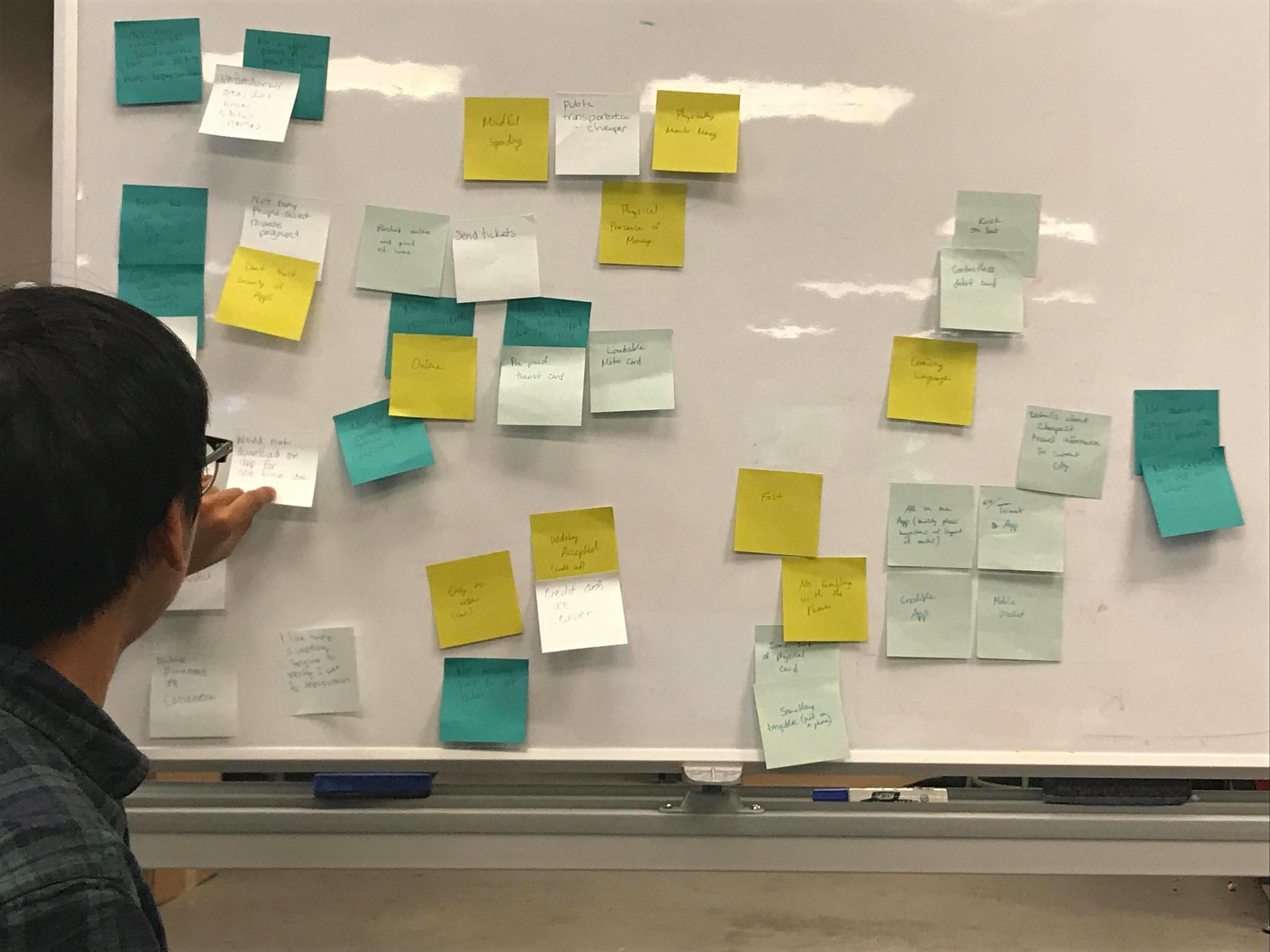
Early in the brainstorming phase, I made an affinity diagram by putting significant findings and quotes from our research on sticky notes, then grouped them into similar categories and would try to brainstorm a cause, then a solution for each theme.
After the research was conducted, from knowing our user's pain points and desires we created a list of design requirements to make sure our solution would meet these goals.
Design Requirements
- Offer user quick payment experience that would be easier than using kiosks or other existing payment methods for tickets
- Match representation of tickets from digital world to real world
- Offer user directions for navigating from locations to landmarks and a way to easily purchase tickets at the same time
- Real time transportation status updates
- Offer popular and recommended tourist destinations and ways to get there through public transportation
Sketching
A few sketches were made to put into context how, when and where the application would be used. One of the biggest issues with the original Transit GO ticketing app was it's unintuitiveness for it's usergroup. Having context as to where and when the app would be used helps with designing the user flow and with making changes to the interface design.
Putting tourists into the context, I had added the idea of having an explore feature that could help tourists find potential landmarks and plan their trips while discovering public transportation routes.
Information Architecture
Once we came up with design requirements and the features our application had to have, a site map was created to figure out the key interactions and how the user can access different features. This would be used to aid in creation of the screens and design by letting us know at a high level how the app’s features function together.
Prototyping
Features
Based on our findings from the user research, our team decided the best direction to go in would be to make a brand new application targeted towards tourists. The app's main features would include buying a ticket like in the original Transit Go app, but also features to explore and help tourists navigate the city and discover new places.
A lo-fidelity prototype was created. Since users mentioned valuing the familiarity of rideshare apps, the new trip planner was created to be map and visual based. Our application also has an explore feature giving users the opportunity to explore the city. The prototype also features a brand new ticket purchasing feature that fixes the usability in the original one, making purchasing tickets easier for the user.
Evaluation
In order to evaluate and confirm the functionality of our lo-fidelity design, we recruited 5 participants who were UW students to interview and conduct usability testing with our application’s key features. Participants interviewed and asked to recall their experiences when travelling and using public transportation.
Conducting these tests helped us gain insights about what a user prioritizes in purchasing a ticket on a mobile platform, as well as what is and is not intuitive. Furthermore, this phase is valuable to our project overall because it serves as a guide for the development of our hi-fi wireframes.
Design
Style
The font used was Open Sans, chosen for its simplicity and welcoming feeling. We choose deep blue as it is a color associated with Sound Transit and the Transit Go app, and a golden sunflower accent to represent the Metro buses of Seattle. The idea was to keep mostly whites with the colors as accents, and light use of drop shadows.
Trip Planner
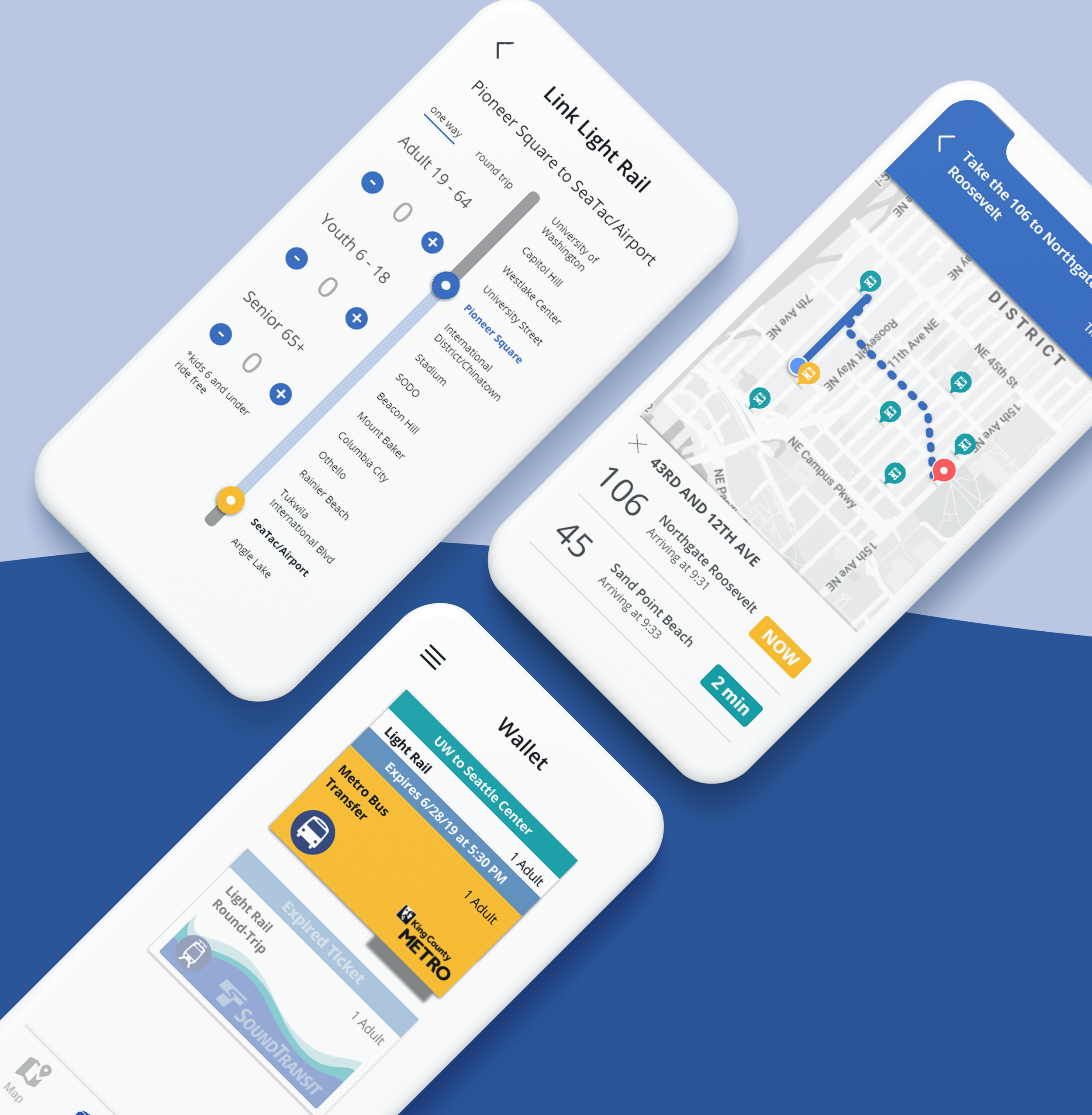
One main feedback from our usability testing was users wanted the ability to see other routes and compare them, thus our redesign gives alternative routes more visibility. Users also noted wanting similar functionalities to One Bus Away and being able to get clear information and instructions on when to use their ticket and where.
Buy
Two major changes were made to the trip planner feature(seen far left) to fit in with the new solution. First it had to be ensured that the stations are displayed as they are laid out in the real world, opposed to listing them alphabetically in the original app. Second, the new app allowed users to select the types and quantities of tickets they need on one screen. In the current Transit Go Ticket App users are required to scroll to see all of the ticket types and must input the quantity of tickets on a different screen.
Wallet
To improve from the original Transit GO application(seen far left), our app matches the design of tickets to their real world representations making the tickets more intuitive for the users. Participants from our usability testing expressed the concern of having transfers or using multiple modes of transportation, so bus trips can be “packaged” in a way they can be easily seen together.
Explore
I conducted competitive analysis with competing apps and based the explore features off Yelp and Google Map’s explore functionality. In our usability testing, users expressed the want for visual aids and a list of recommended places for their chosen preferences. Thus our design offers a way to click around to find new places so users can get more information on potential places they would like to go.
Reflection
This project has grown my interest in mobility and tourism. Although we have had a lot of challenges, this experience has taught me to get creative with methodologies. The iterative field studies were a very unique and effective way of collecting data, and it was very fun to talk to people from all around the world about their experiences using public transportation. Because our sponsors were more focused on the transportation part of it, we were unable to develop the tourism aspect further. However, I'd love to enhance the explore functionality to have the app go in a more city exploration direction.
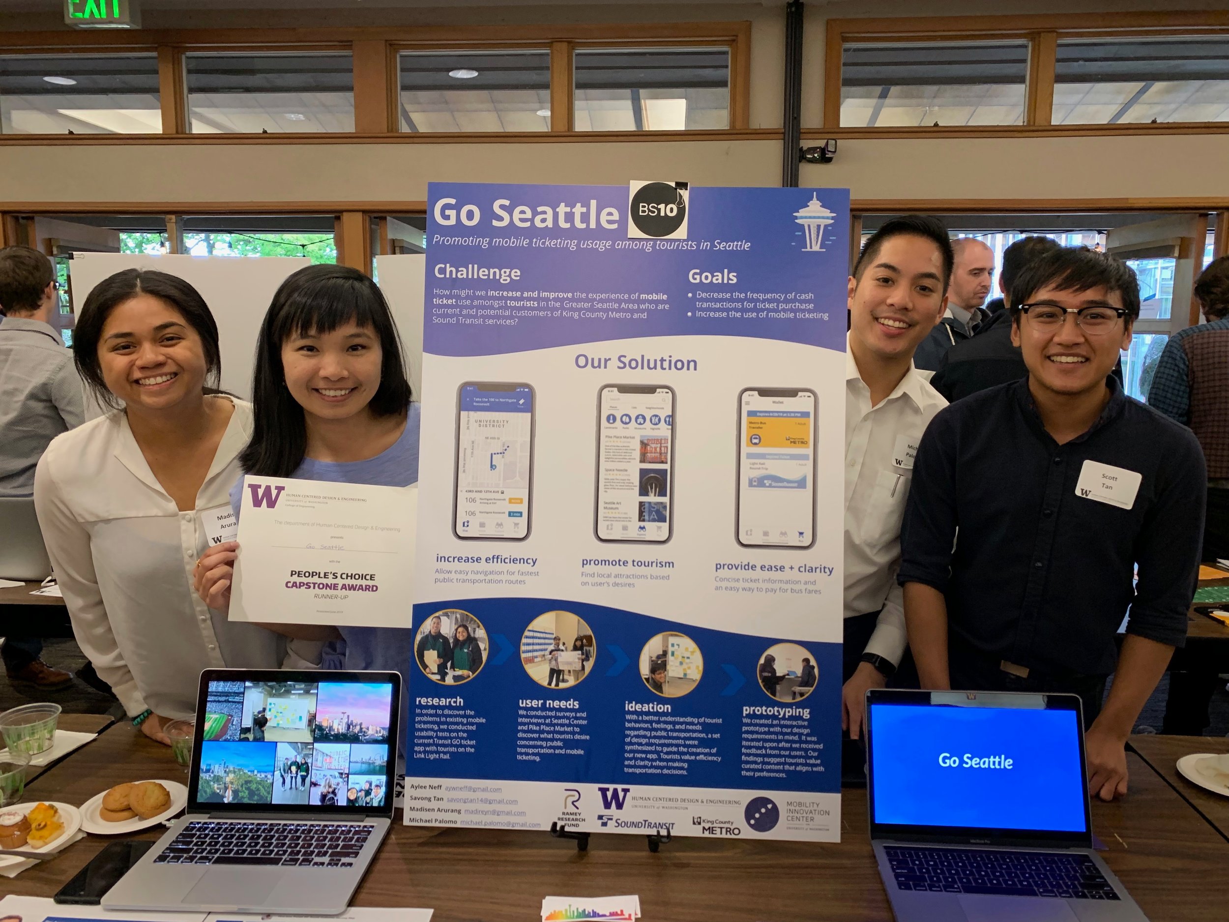
Ideally with the implementation of ORCA 2.0, we hope that the interaction and visual design of Go Seattle will play a part in the new ORCA application, or a partnership with Visit Seattle to have an application to promote local businesses in Seattle among tourists. I'm very proud that our project won the People's Choice Capstone Award at the HCDE 2019 open house, and the application was well recieved by our sponsors.
