Asset Management Tool
Creating a web tool for designers in the worldwide leader of sports.
Designing for designers
In Fall 2019, I had the amazing opportunity to work for ESPN in Bristol, Connecticut as a Product Design intern. I worked alongside senior designers and had the opportunity to work on my own project as the sole design intern in the organization.
The project I worked on was an asset management tool to help make finding and uploading assets such as team logos, colors and head shots an easier experience than the current systems. This tool could make a process that would normally take up to 8 hours reduced to just 20 seconds.
“How can we support the various creative teams at ESPN by reducing the current workflow?”
Investigation
To get a better idea of what users would need, I sought out to do unstructured interviews and contextual inquiry on the current tools they use, and see how they use them. Each current tool was looked at in depth, with some of the tool’s UIs not being updated since they were first created in the late 90s. I also met with developers and the TV team to see how the tools were being used with technology to make logos appear on screens.
Research Questions
How can we make their process more efficient?
What do our users need to complete their tasks?
What content do our users need to work with?
Who uses creative assets?
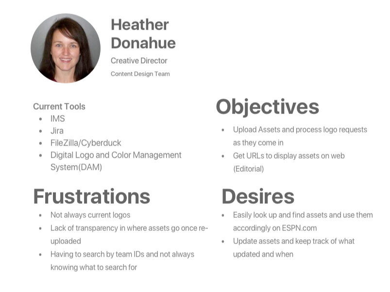
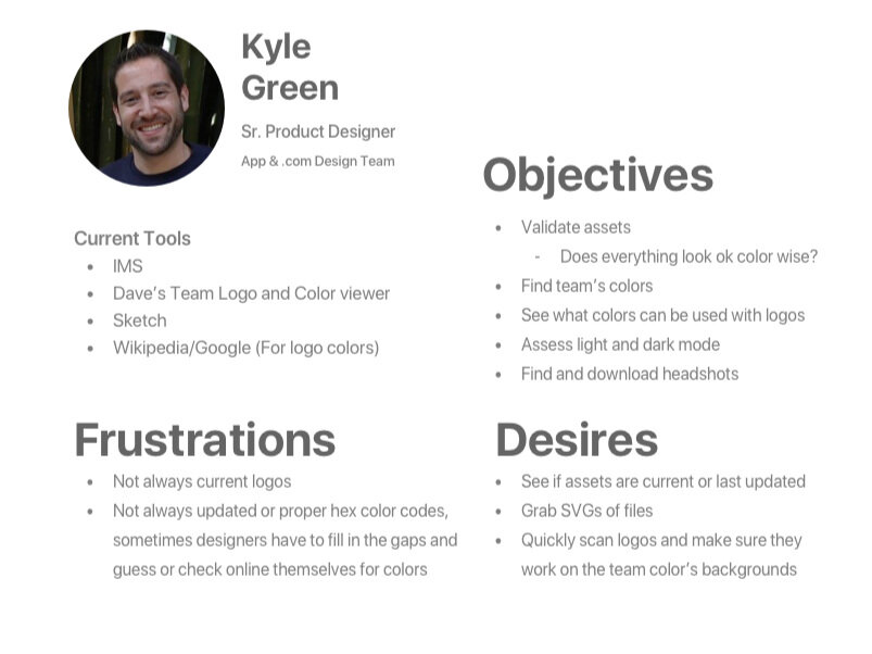
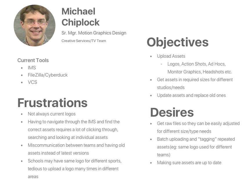
I compiled all my findings in the form of personas, outlined with the goals and frustrations each team had. Since this was a tool to be used internally, my personas were reflective of specific people of various positions who would need to access assets. These include users from the content design team, product design and TV production team.
Product Design and UX Team
Content Design Team
TV Production Team


Current Tools
Each current tool was looked at in depth, with some of the tool’s UIs not being updated since they were first created in the late 90s. I also met with developers and the TV team to see how the tools were being used with technology to make logos appear on screens.
Issues
Current systems are unclear and difficult to navigate
One interviewee said “Once I upload something, I have no idea where it goes to or if it even uploads [on all the services it is being hosted on”.
Inefficient navigation, some tech require multiple nested drop-down
Lacking visual previews
Process requires excessive steps and multiple software to get the same content and perform the same action
Users mentioned using multiple software just to do a single action, like uploading.
Takes time to format or find the correct embedded HTML for an asset to put on a service.
Content has little to no context or is disorganized
Interviewees mentioned not knowing if a file is the latest version or outdated.
Task Flows
After interviewing various members of the teams, I got a better idea of their workflow and visualized the workflows in the form of task flow charts. These would help in understanding the current process and the pain points these users have with the existing tools. These task flows would serve as a good basis for measuring whether the tool was to be more efficient or not.
Iteration
When creating a possible solution, I had to brainstorm and account for the different workflows and figure out what all the users needed in common.
Design Requirements
Navigation
Most efficient way to present content so users don’t have to keep clicking through different categories
Filtering
How to categorize all the content so users aren’t overloaded and can find what they need easily
Display
Having a clean and modern UI that aligns with Direct-To-Consumer International branding and tools
Keeping track of updates and edits
User Needs
Allowing users an easier way to copy and paste URLs, seeing what logos look like on other colors, sizes and download buttons
Having a way to edit and make updates to content and archiving old content
Assets
Organizational structure and Taxonomy
Content more than just logos + colors, images or applications outside ESPN
Concept Feedback & Testing
I presented an early concept back to the original interviewees, and it was well received. However there were more specific pieces of feedback and areas for improvements in context with their workflows:
Different groups wanted different ways to view content, but all agreed it was better to view things at a glance thus two views
Having individual info pop up in another page to show more info and viewing options rather than opening it inside
Being able to compare the logos and see them side by side rather than clicking through at once
Solution
After the first feedback session, I made changes to the UI to reflect their workflow and fit various needs. The visual design was made to be based off various internal software such as Confluence and Dropbox. The styling was kept neutral, in case the tool were to be expanded to fit the needs of the other Direct-to-Consumer International brands under the Walt Disney Company.
Homepage Features
- See what needs to be updated
- See latest changes
- On boarding guide for new users
Individual Logo Page
- See colors
- See on different backgrounds
- Light mode and dark mode
- look at archived logos
Exporting
- Have different file formats for different needs
- Exporting in custom sizes and spacing
- Embedded HTML for web content team
Adding a new logo.
Add a New Asset
- Asks for necessary information
- Promote taxonomy and proper tagging
- Flexibility for tags
Add a new non logo asset. Customization and flexibility in tagging.
Search for mixed content such as logos, headshots or photographs.
Search for logos.
Searching
- Tagged searching
- Sort by
- See necessary information at a glance
- Changing format to fit needs
Reflection
This was my first professional experience in product design and first exposure with a larger design team. I learned about the different design roles throughout the company and got to learn about the workflows of different users and how to make a tool that would be able to fit many situations. My leaders gave me great feedback and the tool was well received as it would be a great help to those who work with digital assets.
Next Steps
The final design was re-presented to the larger product design team and the original interviewees. All of the original interviewees thought the concept would be a great help in reducing workflow and provided more clarity than the original process. Thus the product was well received. To take this project to live, specifications for developers would be created in order for the tool to be further implemented and I would have to work closer with the tech team to see if there are any constraints or legacy issues when it comes to implementing the tool in the greater organization.


