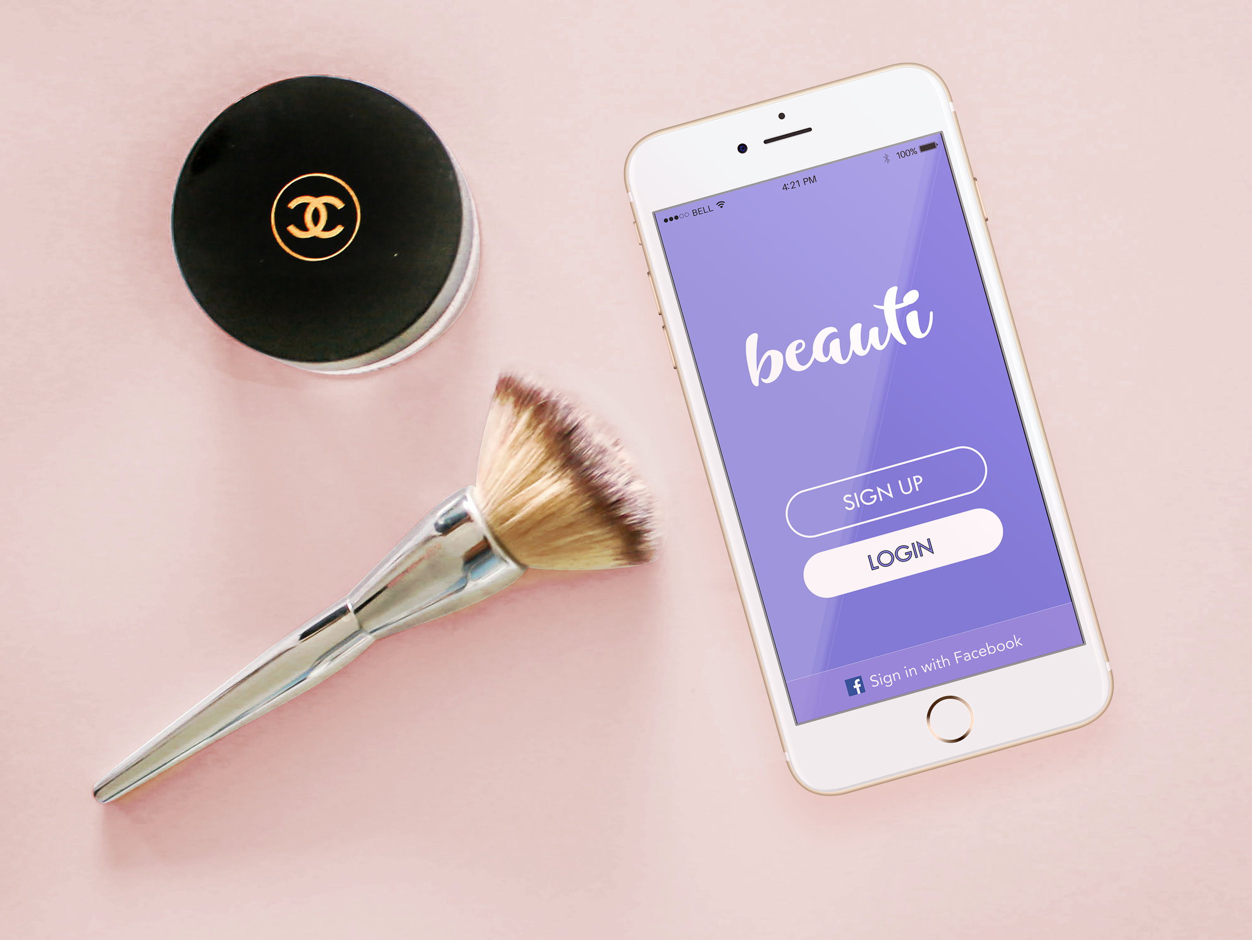
Beauti
An application for underrepresented makeup users to find products that fit them.

beauti
For a quarter, my team and I designed a mobile community application targeted to underrepresented makeup users. The application allows users to connect with each other and find the best products for their skin type through finding the right shade for them and collaborative reviews.
Role
UX/UI designerTime Frame
8 weeksTeam Members
- Savong Tan
- Iman Yusuf
- Michael Palomo
- Priti Patel
Tools
Adobe Creative SuiteProblem Statement
One of the biggest issues makeup users have is finding the right products that work for their skin. Not only is finding products stressful, but the purchasing as well. Should one go in a store and try on swatches - only to feel more uncomfortable with the condescending attitudes from employees? Or risk purchasing online - only to find out the product doesn't fit them at all! These were all real experiences that our users told us about.
How can we create a space for makeup users to have a more welcoming and inclusive experience when it comes to finding products that fit their skin?
“How can we create a space for makeup users to have a more welcoming and inclusive experience when it comes to finding products that fit their skin? ”
Context
This quarter-long project was for my User-Centered Design class. Our team chose to focus on the field of makeup and makeup users. I was really excited to start this project since I knew nothing about makeup and did not know what kind of problems users experienced in this space, other than basics about skincare. Thus, going in with no assumptions would kick off our extensive secondary research and interviews in order to figure out what specific problems to tackle in the space.

To do some research, our group went to an actual makeup store. The other male designer and I were both ignored. When we walked in, the sales associate said “Hello ladies!” and did not acknowledge us. Sales associates kept asking how the two women in our group were, but we did not receive the same attention. This lines up with what participants said about feeling judged or being treated condescendingly by employees if they were not judged to be in the store’s main demographic.
Research
There weren't too many large scale preconducted surveys on makeup use avaliable to us, but we were able to find a 2007 study from Estee Lauder that found that 77% of women are wearing the wrong shade of foundation. With the Rihanna's Fenty beauty line launch in 2017 introducing more than 40 foundation shades to cater to people with underrepresented skin tones, it was clear that there was a demand for diversity in the beauty industry and representation in products. Our research focused on the issues in the purchasing process of makeup.
What do makeup users struggle with?
To figure out the struggles of makeup users, we interviewed four college-aged women of color with diverse experiences with makeup ranging from being infrequent users to considering themselves experienced. Each person in our group recruitered one person to interview. Participants were asked questions based on their experiences with makeup, their brand preferences, how they find products and any pain points they have with the makeup purchasing process.
- 3/4 participants said they make purchasing decisions based on reviews from social media influencers with similar skin tones and skin types.
- 3/4 participants preferred shopping in store because of being able to test products.
- 2/4 participants reported feeling judged or uncomfortable when shopping in store by employees.
“It’s difficult to find that perfect shade!”
“My biggest struggle is finding something for my skin type.”
“Trying to match my skin tone is a struggle.”
Meeting needs of diverse users
We were able to form two personas based on qualities of the participants and their experiences with makeup. The personas are a representation of makeup users of different makeup skill levels, a user who considers herself an expert in using makeup, and a user who is just getting into using makeup. We wanted to ensure our product could be accessible to those who aren't as comfortable using makeup as well as those with heavy exposure to makeup.
After creating the personas, we made a user journey map for how a potential makeup shopping experience would be like. To ensure authenticity, our group went to a makeup store together to try to emphasize with our users and took observations on shopping for makeup as a minority in the beauty industry. The non-makeup users in our group were completely coldly ignored by the employees, which matches the stories our participants gave us about being judged on whether they were wearing makeup in the store or not.
Two personas that the product’s user flows would be based on, with Aaina, a person who is new to makeup and feels more intimidated by the process, and Nikki, a person who is interested in reviewing makeup and sharing her purchases on social media to help others.

A user journey map for the feelings one might feel when buying makeup in store for the first time.
Competitive Analysis
Based on interview findings, it found that makeup users tend to not use specific makeup apps when it comes to making purchasing decisions, but rather use social media or shopping reviews to influence whether they purchase an item or not.
To see what apps were currently on the market specifically for helping makeup users make purchasing decisions. Each person in our group would find 2 apps to analyze and note what worked with the apps and what didn't. I found bareMineral's made2fit app and L'oreal's Makeup Genius. Both apps were made by popular companies in the cosmetics industry.

bareMineral's made2fit app allows users to use their smartphone's camera to calibrate their skin tone, and then create a specific bareMineral's foundation just for their skin tone.
- Does not take into account skin types or skin conditions(sensitive skin, blemish-prone etc)
- Only offers a single expensive product, rather than cheaper alternatives
- Instructions for their "skin calibration" is confusing at first.
L'oreal's Makeup Genius app is a AR makeup app that allows the user to use their smartphone camera to try on different products and hair colors, and offers specific products users can purchase.
- Compared to other virtual makeover apps, it actually offers real products people can buy
- AR feature does not work with people who have darker or tanned skin
- Products for selection are limited

Ideation
Once the research phase was completed, we were able to condense our thoughts and define our problem and the current market needs, and use the findings to come up with some design requirements for our product to have. These requirements would develop into the key features of the product.
We decided as a group to go with a mobile app because of the camera functionality would be an integral part of our product, users would be able to use their camera to take the skin tone quiz, potentially try on products with an AR feature and easily upload their product reviews. Some other scrapped ideas included a physical prototype that could be used in store, or a physical personal device to see a user's skin tone. The decision to create a mobile app would allow to flesh out the social media aspect of the product.
Design Requirements
Using our interview findings, in order to tackle pain points our users had with incertainty of buying products and not having a welcoming environment when it came to makeup. As a group, we brainstormed some features we wanted to acheive in our product, and how the scenarios could work out in our mobile app.
| Feature | Action | Object | Context |
|---|---|---|---|
| Ensure users are able to find products within their desired price range. | Aggregate different brand prices based on the user’s input | The search bar where the user can put in their preferences | When the user puts in their preferences in the search bar on the home page |
| Ensure products and reviews are for a diverse audience and to be inclusive of all skin types and conditions. | Create various categories based on skin type, skin tone, etc. | Based on inputted information, products reflecting their goals will showcase in their news feed | On the user’s news feed page |
| Determine user’s skin type and find products that fit user accordingly. | Manual input methods based on needs as well as virtual scanner that will determine skin type accordingly | Category bar to input skin type + virtual face scanner | To ensure a feed designed for the user’s needs |
| Giving users a sense of confidence based on the reviews they receive while utilizing our platform. | Give product reviews for their skin tone as well as recommendations to fit the user | The review page with information as well as personalized recommendations | To make the users more confident in their ability to find makeup that is right for their skin |
How would the product work?
Once we had tangible design requirements, each person in our group created 2 storyboards to lay out the functionality for potential interactions with our product. My two storyboards are as followed.

An example of how a user would use the review feature of the app, we wanted to make sure it would be a smooth and quick experience.

A concept sketch for an early feature of an AR makeup helper. This idea did not make it to our final design as we wanted to focus more on the social aspects of the app rather than advertising products.
Structuring the features of the application
Once we figured out the direction we wanted our product to go in, an information architecture diagram was created with the key features of our application. To ensure the flow would be easy to understand and users could easily find what they are looking for. I was in charge of creating the diagram and got feedback from my groupmates on which features we would need to add, and how our onboarding process would be like.
Since social media was so crucial for making makeup purchasing decisions, we decided to go in the direction of creating a makeup social network where users could connect with others and share reviews for products.
UI Creation
Testing early and quickly
Based on our information architecture, we created paper prototypes we would test with potential users to see how smoothly our key paths could be followed. These would be used to conduct guerilla user evaluations and allow us to address any problems or confusion early on.
One of the three paper prototype user flows we created
Collection of feedback we got from users who we tested our paper prototypes on.
Cleaning up and moving to digital
After testing out the paper prototypes, we created annotated wireframes based off the feedback we received from users of the paper prototyping tests. A few users said that our buttons and icons were not intuitie to the user, so we made our wireframes look less busy so the user would not experience information overload when trying to complete the tasks. These annotated wireframes were created using Sketch.

Hi-Fidelity Wireframes
I was in charge of creating the hi-fidelity mockup UI’s for our product. We focused on three main features, the skin tone quiz, user profiles and product pages. We wanted our app to look engaging and have a royal feeling towards it, and used purple in comparison to other beauty apps that use pink. We avoided using any feminine makeup imagery or icons that may have been too stereotypical for our diverse audience.
Skintone + Skin type quiz
One of our app’s main features was a way for users to easily find what their skin tone was and skin type. In order to find their skin tone, users would follow a tutorial that would involve tapping their camera to various areas of their face, and the data used would “calibrate” the user’s skin tone for them, allowing them to find products that would fit their skin tone. We wanted users to be able to easily follow the tutorial and be able to pause and pick up when they left off whenever they wanted. After the skin tone quiz, they could take a skin type quiz that would ask a series of questions to determine if their skin was oily, dry, or a combination of the two. They could also choose any tags that they personally resonated with like frugal, matte, etc to find products that fit their needs.
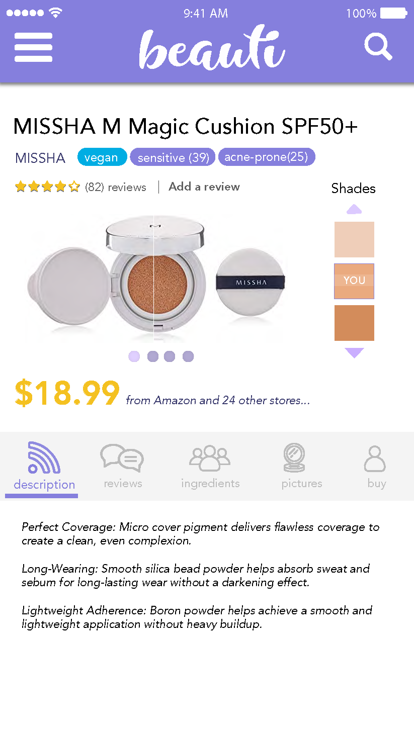
Product Page
Our product page would display relevant information users wanted to see the most, which we found from our interviews were the shades of makeup. The shades bar on the side allows users to compare their skin tone with the product’s specified skin tones. To promote collaboration, each product has tags that users can add to if they feel the product fit for them. Users are also able to see all the stores that offer the product and sort by prices.


Note: Vegan here refers to preference for cruelty-free brands (brands that don’t participate in animal testing)
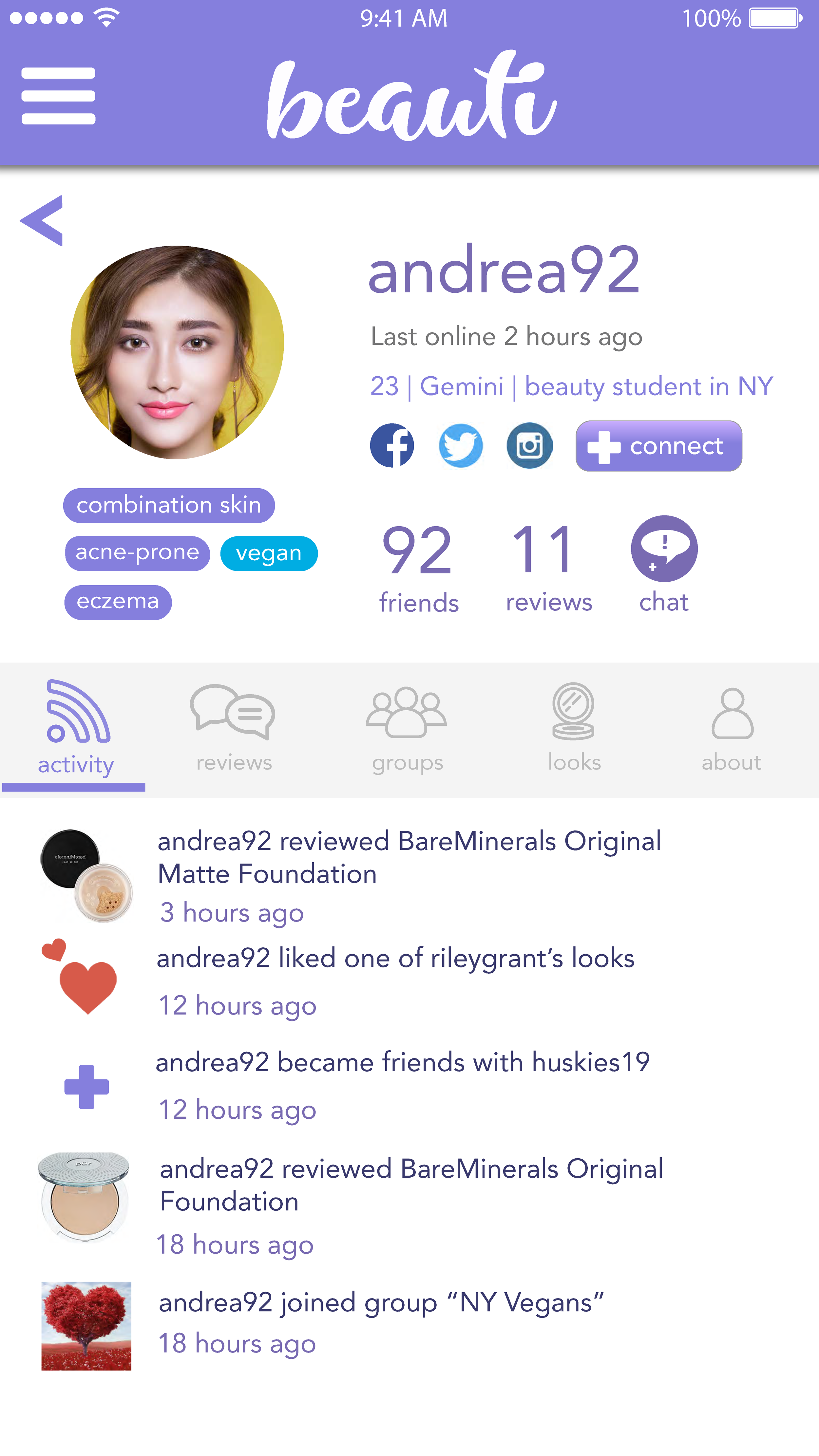
Social Media Profiles
For the social media aspect, we wanted to emphasize on connecting users so they would be able to share and recommend products to each other. In our interviews we found that our user group relied on social media and product reviews from others when it came to making purchasing decisions. Users would be able to connect with each other through sharing reviews and pictures of their makeup.
Reflection
Given more time I would...
- Expanded the user research phase, possibly conducting more quantitative surveys
- Interview even more groups underrepresented makeup users (People with skin conditions, LGBTQIA+ people, male makeup artists, people who have an interest in makeup but have no idea where to start).
- Conducted usability testing on the high-fidelity mockups to understand if our systems are intuitive and needed for our user base
- Code and create more functional prototypes
- Create a physical in store device to complement the mobile application
- Collaborate with products that may offer similar products(eg. bareMinerals made2fit)
Overall this was an exciting project to work on, my team was able to grow our design skills and put all our strengths forth. The topic of makeup was something I knew nothing about, but I was able to empathize more with our user group through the user research conducted, the trip to the makeup store and through the feedback we received on our paper prototypes.

